Case Study
Chemcrete
Creating a strong digital foundation for a 35 year old concrete specialist through a complete brand identity, website, and clear market positioning.
The Chemcrete Identity
A visual system built on industrial strength and material honesty.
Used for headlines, section titles, and all display text.
Used for body copy, descriptions, and UI labels.
Top of the range concrete products.
Serving the construction and civil industries across South Africa with SABS-compliant materials and a focus on quality, affordability, and customer satisfaction.
The Work in Context
Brand applied across physical and digital touchpoints with a cleaner, more editorial presentation.
A 35-year legacy, invisible online.
Chemcrete has been supplying the Cape Town construction and civil engineering industry with SABS compliant concrete products for over three decades. Their reputation on site is solid and trusted across the Western Cape, but online they were completely invisible.
They had no website, no clear brand, and no way for potential clients to verify who they were or what they offered. In an industry built on trust and credibility, this was holding them back more than they realised.
Industrial strength. Refined presentation.
We started by understanding the business from the inside out. Through conversations with the team and key stakeholders, we explored how Chemcrete sees itself and how clients describe it. Two qualities stood out immediately: reliability and simplicity.
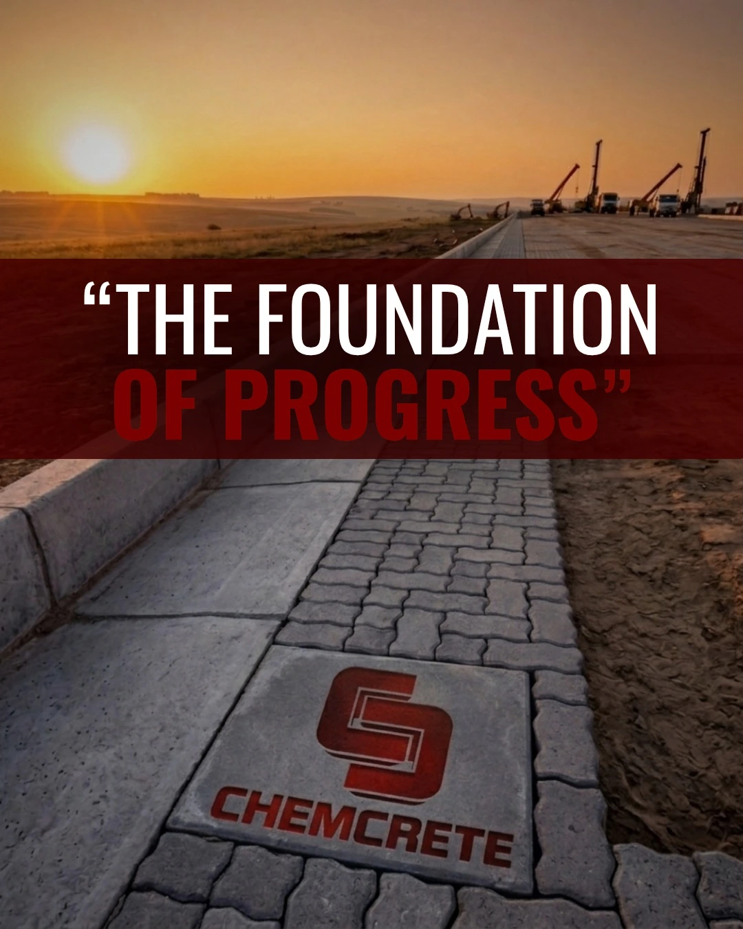
Instead of changing who they are, the goal was to express it properly for the first time. The visual direction took inspiration from industrial environments, using honest materials, strong structure, and confident typography while avoiding the usual construction clichés.
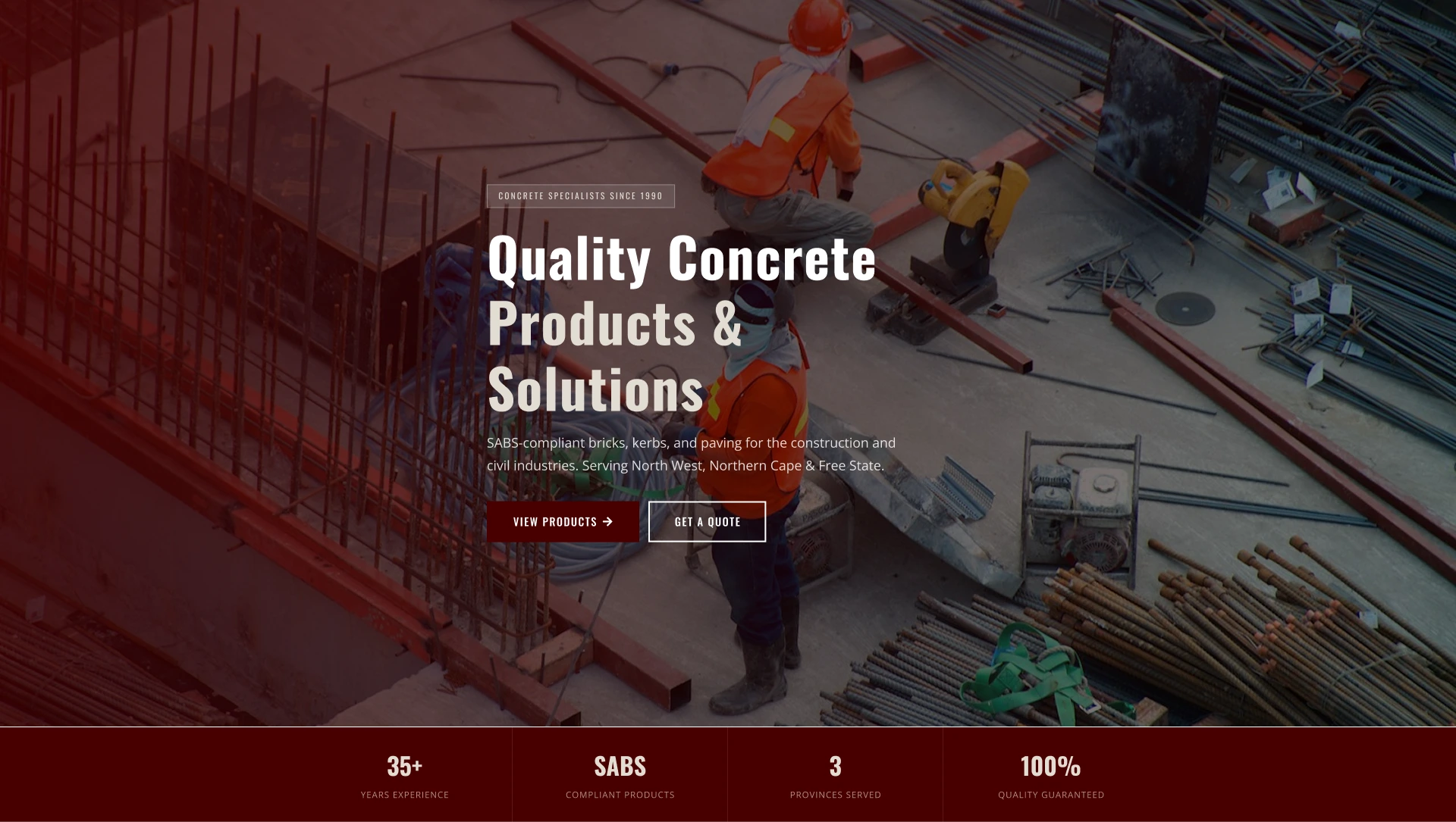
The website was designed to help contractors and engineers quickly understand the product range, trust the business, and take action without friction.
Honest and industrial. Strong, but still approachable. Built to last, not just to follow trends.
A deep oxblood tone leads the palette, giving the brand a sense of authority and experience while standing apart from the typical orange and yellow seen across competitors.
A clean, fast website designed around trust, clear product information, and making it simple for contractors and specifiers to get in touch.
Built from the ground up.
Every detail carefully considered.
We delivered a complete brand system and digital presence through one focused project. The work covered identity, digital, and physical touchpoints, creating a consistent and professional presence wherever clients interact with Chemcrete.
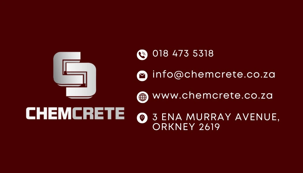
We created a brand system that feels established and dependable. This included a logo suite, colour palette, typography, and clear brand guidelines designed to communicate confidence and credibility.
The site was built to make it easy for contractors and engineers to explore products, confirm the company’s legitimacy, and get in touch without hesitation.
We extended the identity across both physical and digital touchpoints, including business cards, signage, and branded materials to ensure consistency in every interaction.
A 35-year business, finally positioned to grow.
Chemcrete now has a digital presence that finally reflects the quality and experience they have built over 35 years. Potential clients can easily find them, understand what they offer, and reach out within moments.
The new identity sets them apart clearly from competitors. The deep red colour palette and strong typography communicate authority and experience without needing to say it directly.
“Contractors were Googling competitors and making decisions before they ever picked up the phone.”